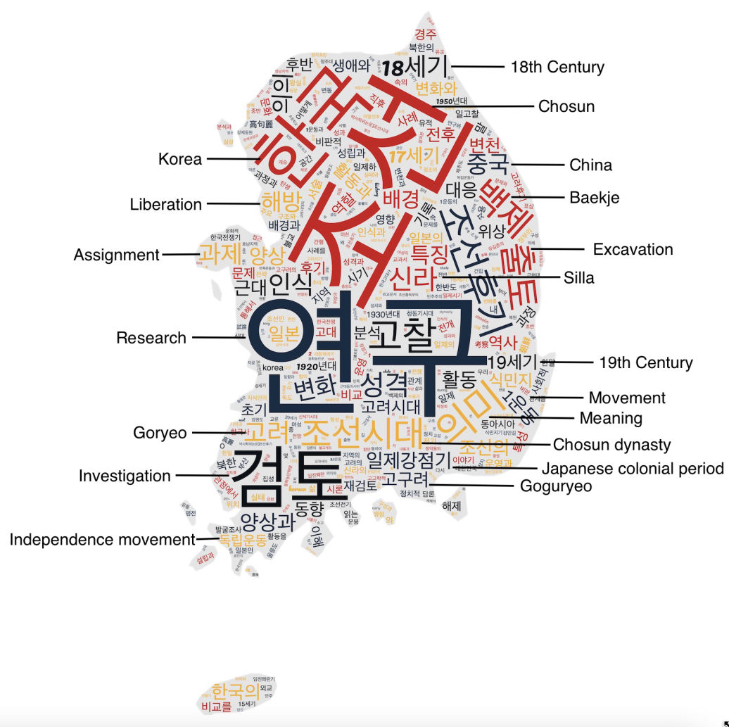
WordCloud
WordCloud can be done using various open source toolkits (e.g., MonkeyLearn WordCloud Generator, WordArt.com, Wordclouds.com, TagCrowd, Tagxedo, and Python). This WordCloud is generated using Jason Davies. It is a Wordle-inspired word cloud generator written in JavaScript and available on GitHub under an open source license as d3-cloud.
The layout algorithm itself is incredibly simple.
For each word, starting with the most important: It attempt to place the word at some starting point: usually near the middle, or somewhere on a central horizontal line. If the word intersects with any previously placed words, it moves the word one step along an increasing spiral. Then, it repeats until no intersections are found.
From this WordCloud visualization, we can see the most frequently mentioned words are;
Chosun(조선), Korea(한국), Research(연구), Investigation(검토), Baekje(백제)*, Silla(신라)**, Excavation(출토), Goguryeo(고구려), Liberation(해방), Movement(운동), and Japanese Colonial Period(일제강점기).
*One of Korea’s so-called “Three Kingdoms,” along with Goguryeo to the north and Silla to the east. It ruled over the southwester part of the Korean peninsula from 18 BCE to 660 CE.
**Or Shilla (57 BCE – 935 CE) was a Korean kingdom located on the southern and central parts of the Korean Peninsula.
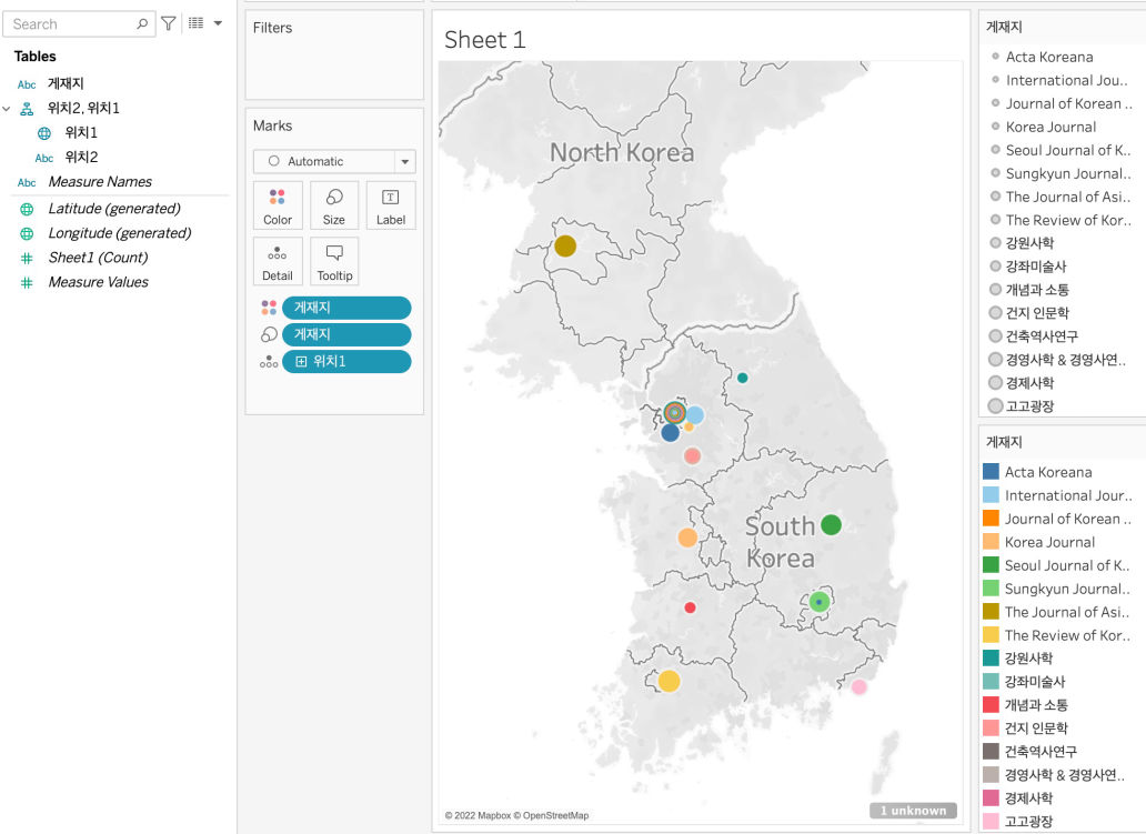
Mapping
Tableau can be a free easy mapping tool. Using Tableau, you can also make an interactive map. Tableau divides your data into dimensions (independent variables) and measures (numeric values). Then, it classifies them into datatypes (text; number; date…). Depending on data source, Tableau can automatically geocode the geographic dimensions. But, sometimes, it cannot recognize a correct data field.
For this exercise, I first extracted the latitude and longitude data of publishers’ cities from Google Maps, and then assigned the Geographic Role to these values. I created the map by putting the longitude data into the Columns and latitude data into the Raws. To create a map that shows a point for the location of each publisher, I dragged the Location dimension into the Detail button in the Marks pane. To show how many publishers are located in that city, I dragged Publisher dimension into the Size button in the Marks pane.
Since I have many publishers in my dataset, I used different colors for different publishers by dragging the Publisher dimension into the Color button in the Marks pane. I also made the legend to show the color or each publisher.
From this map, we can see the most publishers, including International Journal of Korean History, 건지인문학, and Acta Koreana, are located in Seoul, South Korea.
We can also check most publications are from 건축역사연구, The Review of Korean Studies, The Review of Korean Studies, Sungkyun Journal of East Asian Studies, 강원사학 and 강좌미술사.

0 Comments